Ways to describe Pie charts:
You may find different types of Pie charts-like some with percentage or without percentage or number, but for every kind of pie charts the rule is same. By following some techniques, you can easily learn the description of the pie chart.
Topic:
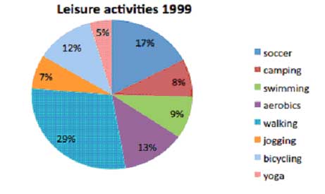
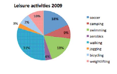
The pie charts demonstrate the results of a survey into the most popular leisure activities in the USA in 1999 and 2009.
Summarize the information by selecting and reporting the main features, and make comparisons where relevant.
You should ask following questions before going to write the pie charts:
If you look at the chart, you will find:
Step 1: You should consider following things:
1. The biggest and smallest number
2. What’s gone up & down
3. What hasn’t changed and what is new
You will find following answers:
1. In both periods walking is most popular
2. Weightlifting is new and yoga disappears
3. Swimming becomes double
4. Aerobics, jogging and cycling all goes down
5. Soccer and camping have slight changes
Step 2: How to organize the report:
· Write the main points first
· Write similar group together
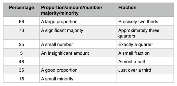
Describing percentage in different ways:
- Number of activities
- Is there any similar activities
- Do you find any change between these two years activities
- How many types of color
If you look at the chart, you will find:
- Total 8 leisure activities each year
- 7 out of 8 activities are same
- There are rise and fall in two years leisure activities
Step 1: You should consider following things:
1. The biggest and smallest number
2. What’s gone up & down
3. What hasn’t changed and what is new
You will find following answers:
1. In both periods walking is most popular
2. Weightlifting is new and yoga disappears
3. Swimming becomes double
4. Aerobics, jogging and cycling all goes down
5. Soccer and camping have slight changes
Step 2: How to organize the report:
· Write the main points first
· Write similar group together
Describing percentage in different ways:
Steps to follow:
Paraphrase the topic
Write overview (the main idea of the pie chart)
Paragraph 1
In both years, walking (29% & 30%) is the biggest slice of the pie
Weightlifting has replaced yoga
Paragraph 2:
- Mention soccer and swimming first then jogging and aerobics last
- Mention the biggest changes – swimming the big riser and cycling, jogging & aerobics all big fallers.
A good version
The two pie charts illustrate the changes in popularity of different leisure activities in the United States of America between 1999 and 2009 over 10 years.
Overall, the most popular leisure activities were almost the same over 10 years. Among all the leisure activities walking was the most popular in both years and the yoga was replaced by weightlifting.
It is obvious that walking was the most popular activity in both 1999 and 2009 with around 30% of Americans preferred it. On the other hand, yoga has disappeared in 2009, while weightlifting was preferred by 10% of people.
Swimming in 2009, became almost doubled from 9% to 18% in popularity. The second most popular activity was soccer at just under 20%. Most of the other activities became less popular over the same period, with cycling, jogging and aerobics all falling by half to under 10%. Camping with around 9% remained almost unchanged over two decades. In stark contrast, around half Americans went cycling in 2009 compared to ten years earlier and it became less popular than camping, at 7% and 9% respectively.


